


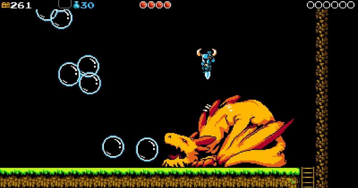
I’ve been reading this fantastic blog on how the Shovel Knight designers and artists used NES constraints to help guide Shovel Knight: but they were not entirely beholden to them. This is very much how I’ve approached my own practice of pixel art in my own games: using constraints to guide design and art direction, but very much abandon them when it’s better for the game to do so.
Especially interesting is the section on color palette choices!
“The NES was only capable of spitting out 54 different colors… and that’s not a lot. The problem for us mainly came in trying to display a gradient in most hues. For example, there isn’t a very useful yellow, the darker spectrum of color is very underrepresented, and there aren’t many shades that work for displaying a character with a darker skin tone. Sticking to the NES palette was a big priority for us, though, as it gives a very distinctive look. In the end, we ended up with only a few extra colors.”
#Reading #design #insights #breaking #NES #constraints


+ There are no comments
Add yours