


Article content
Lots of Saskatchewan Roughriders fans learned a new word this week.
“Obsidian.”
Gotta admit, that’s a new one for anyone who never watched “Game of Thrones.” For those of us who checked Merriam-Webster, “obsidian” is not a colour. It’s a sharp, shiny rock. Formed by lava. From a volcano. It’s usually black, but it can vary in colours from snowflake-white to blue, red, brown and green.
Advertisement 2
Article content
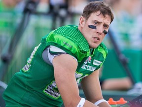
That’s where the Roughriders came in, claiming “obsidian green” as the primary colour for their new alternate jerseys — complete with a new S-shaped helmet logo — that the team will wear for home CFL games July 19 and Oct. 26. Those dates respectively are “Green is the Colour” and “Fan Appreciation” promotional days.
Never doubt that CFL teams are like their NFL, MLB, NBA, MLS and NHL counterparts. This is all about selling merchandise.
The Roughriders routinely sell more merchandise than the other eight CFL teams combined. They sold $3.8 million in merchandise according to last year’s financial report. They used to rank third among Canadian franchises for merchandise sales, trailing only the NHL’s Montreal Canadiens and Toronto Maple Leafs. Devoted fans have likely purchased every green iteration possible of S-stamped merchandise available, from onesies to toques to drink glasses.
They need something new. Voila!
With extensive help from retail operations director Mark Habicht, Riders president/CEO Craig Reynolds presented the alt jerseys Thursday evening and praised the people who worked on the project while explaining the symbolism of the colours and logo. Truth be told, it’s a good-looking kit.

Headline News
Article content
Advertisement 3
Article content
Several paint companies offer “Obsidian Green” among their myriad colours of “Gentleman’s Grey,” “Poised Taupe” and “Chalky Blue” that are available for house interiors. It’s basically black, but according to the Roughriders, “obsidian” is the “darkest shade of green available until it turns black.”
Couldn’t find that defined anywhere, but it’s their specialized colour scheme, so OK. The alt jerseys also feature “Rider” and “emerald” green with a traditional “Wheat Spike,” a modernized “symbol of Saskatchewan and its people … topped by a 13th kernel paying homage to the 13th man and our incredible fan base.”
If only Roy Shivers had called his jerseys “obsidian green” instead of “black.” Maybe they would have been better received when Shivers, Saskatchewan’s general manager from 2000-06, secretly ordered new uniforms for the team — they were almost completely black with green trim.
It was an era when numerous teams were incorporating black into their colour schemes, but with Shivers and head coach Danny Barrett being the only professional football franchise featuring a Black management team there were shameful examples of racist pushback from some fans and members of the team executive. Still, the black jerseys sold fairly well. And the players loved them!
Advertisement 4
Article content
The criticism was less severe when Phil Kershaw, the community-owned team’s president from 1989-93, added silver (and some black) to update the team’s basic green and white. The coach Kershaw hired, Don Matthews, despised a later version of the jerseys that featured bright green tops and pants. Matthews never wanted his players looking like “giant pickles.”
In 2014 the Roughriders tried a gaudy colour scheme that Reebok dubbed its “Signature Uniform,” a mix of “old green” and “blitz green” speckled from helmet to socks with cartoonish wheat kernels. Some people called it the “watermelon” look.
In 2010, to honour the Roughriders’ 100th birthday, the team donned red and black jerseys; head coach Ken Miller and his staff jumped on board with similarly coloured Zubaz pants. Red/black didn’t really catch on in Saskatchewan, but did in Ottawa.
The Roughriders actually made their 1910 debut wearing purple and gold for one season before switching to blue-and-white uniforms, also for one season, before being red and black for 30-some years.
When a Roughriders executive member purchased complete sets of green-and-white jerseys on sale in 1948, that’s when the team became associated with those colours, later adding the first version of the well-known S logo.
Advertisement 5
Article content
There weren’t many uniform changes in those days, likely because long-time general manager Ken Preston was tight-fisted with his budget. The franchise couldn’t afford regular upgrades, there weren’t any big corporate sponsors involved and selling Riders merchandise wasn’t a big deal.
Nowadays whenever a new sporting goods company now gets involved with the CFL, from New Era to adidas to Reebok, the Roughriders’ jerseys get tweaked. In Saskatchewan, for 76 years and counting, some shade of green is still the colour.
Recommended from Editorial


The Regina Leader-Post has created an Afternoon Headlines newsletter that can be delivered daily to your inbox so you are up to date with the most vital news of the day. Click here to subscribe.
With some online platforms blocking access to the journalism upon which you depend, our website is your destination for up-to-the-minute news, so make sure to bookmark leaderpost.com and sign up for our newsletters so we can keep you informed. Click here to subscribe.
Article content
#Roughrider #jerseys #arent #black #theyre #obsidian #green


+ There are no comments
Add yours